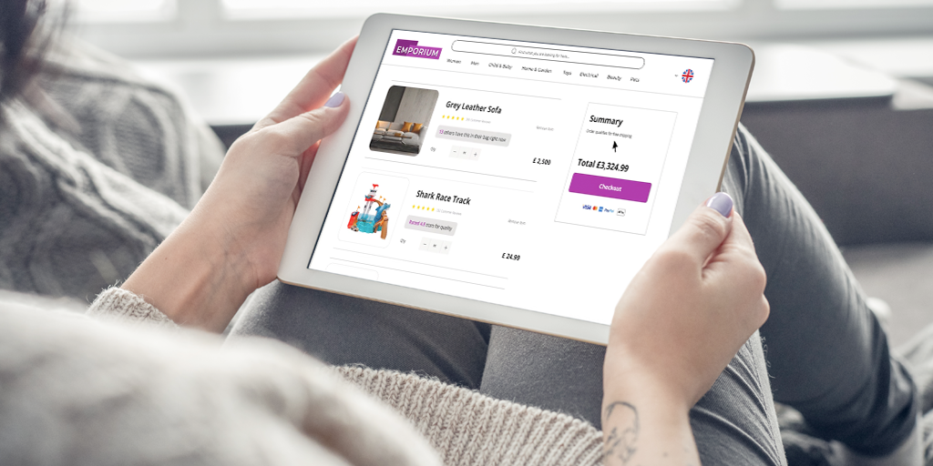
For any UK eCommerce business, attracting visitors is only the first step. The true challenge and opportunity lies in converting that interest into sales. Learning how to increase conversion rates is fundamental to maximising your online store’s potential. A high conversion rate means you’re not just getting more traffic, but more customers and ultimately, more revenue from your existing audience. Understanding how to increase ecommerce conversion rate specifically can transform your digital storefront from a passive catalogue into an active sales generator. Prioritising the improvement of your eCommerce conversion rates is crucial for achieving sustainable growth and a healthier profit margin in today’s competitive online landscape.
When and how to analyse your eCommerce conversion rate
If your traffic is growing but sales aren’t keeping up, it’s a clear sign your site may not be converting visitors effectively.
Here are key indicators that you need to invest in conversion rate optimisation:
- High traffic, low sales – If you’re getting strong sessions but a low purchase rate, there’s friction in your funnel.
- Cart abandonment – Are users adding products to cart but not completing checkout?
- Low mobile conversion rate – Over 50% of traffic is mobile, but mobile CRO is often neglected.
- High bounce rate on product pages – Shoppers may not be finding what they need quickly.
- Poor performance from key landing pages – Especially if they’re tied to paid traffic or campaigns.
Once you’ve identified that improvements are needed, the next step is analysing your full conversion funnel to pinpoint where shoppers are dropping off. Mapping the journey from landing page to checkout helps reveal which stages require the most attention.
Key metrics to analyse:
- Bounce rate on landing pages
- Product page engagement (scroll depth, clicks, dwell time)
- Add‑to‑basket rate
- Checkout initiation rate
- Checkout completion vs abandonment
Using tools such as Google Analytics and Microsoft Clarity provides both quantitative and qualitative insights into shopper behaviour. With a clear view of where friction occurs, you can prioritise the CRO strategies that will have the biggest impact on your eCommerce conversion rate.
What impacts eCommerce conversion rate?
The reasons shoppers don’t convert are extremely varied. Some are easily quantifiable whilst others are harder to predict. Of the more quantifiable examples, these can include:
- Not enough product information
- Poor navigation / hard to use
- Unclear or conflicting ‘call to actions’
- Low quality imagery
- Lack of shopper trust
- Minimal social proof
- Long and complex checkout
- Slow website
- Price too high
- Product not available
Reasons that are harder to measure could include:
- The online equivalent of ‘window shopping’: This passive browsing state may be an individual who has no intention of buying but simply enjoys seeing the latest a brand has to offer
- Pre pay-day browsing: At this point, a shopper may be adding items to their wishlist but will be returning following payday. It is quite common for retailers to see a spike at the beginning of the month for this reason
- Waiting for sales: Shoppers become accustomed to sales periods whether this be mid-season sales or the more common end of season or holiday sales
Ecommerce Conversion Benchmarks in the UK
Understanding how your online store performs against wider UK benchmarks can help you identify whether your conversion rate is healthy for your sector. According to recent data from Shopify, the average UK eCommerce conversion rate generally falls between 1% and 3%, but performance varies significantly depending on category, product type, traffic intent and how much consideration is required before purchasing.
Typical benchmarks across UK retail
- Overall UK average: ~1–3%
- Strong performance: 3%+
- Category-dependent ranges: High-intent categories (like grocery) often sit above the national average, while industries with longer research cycles — such as electronics or furniture — generally convert at lower levels.
Because shoppers behave very differently across industries, it’s more valuable to compare your results against your specific vertical rather than aiming for a single “ideal” number. If your store consistently performs below the typical range for your industry, this may indicate friction in areas such as product detail clarity, checkout usability, mobile experience or trust signals.
Conversion rate optimisation strategies for eCommerce websites
1. Enhance User Experience (UX) with persuasive design and clear copy:
The first strategy to increase conversions across your eCommerce site is persuasive design, there are 5 key elements to persuasive design:
- Clear Information: Shoppers should immediately know who you are, what value you provide and why they should care
- Visual Appeal: As with the copy, this should be simple and easily direct shoppers to where you want them to go
- Visual Hierarchy: What do you want shoppers to engage with first? This should be at the top of your visual hierarchy
- Grab and retain attention: The focus here is on engaging with your shoppers. What encourages shoppers to go deeper into your site than simply visiting the homepage?
- Match user intent: Be clear on what the intention of each page is and make all elements on the page focus towards that purpose. This doesn’t necessarily mean limiting yourself to one CTA but if the purpose is to get people to buy, then how do you make this easy for them? i.e. one CTA may be ‘add to bag’ whilst another is ‘add to wishlist’ to help make it easier for them to buy in the future
In addition, ensure your design is mobile-friendly, as recent data show, about 75% of UK eCommerce traffic comes from mobile devices. Clear navigation, fast-loading imagery, easy-to-tap buttons, and streamlined page layouts help remove friction and create a smoother path to purchase for on-the-go shoppers.
Visitors to www.marksandspencer.com are welcomed with a large header that immediately captures their attention featuring bold heading and visuals and relevant content such as sales, new items and other promos.
2. Optimise product descriptions with A/B testing and effective content hierarchy:
The Product Details Pages (PDPs) are arguably the most important pages on your website as they lead directly to a sale and because of this it should always be a focus in your CRO. Knowing what information a shopper wants and presenting it in a clear, intuitive manner is the key to its success. Testing different PDP designs with A/B or multivariate testing should form a key part of your Conversion Rate Optimisation strategy. Tests may include: adding in social proof, including video, rearranging the hierarchy of different text, improving the readability of the description etc. The example below from argos.com is a strong example of a PDP thanks to:
- A detailed but well-structured product description, broken down into bullet points and directing users to videos on key topics
- A social proof integration in the product gallery
- Clear delivery options
- Alternative payment options with an option to opt into a finance plan
- The option to compare the product to alternatives within the wider product catalogue
3. Build trust with social Proof Integration:
Weaving in social proof across the buying journey increases shopper trust and is statistically proven to generate consistent and substantial conversion rate uplifts. Social proof can come in many forms including:
1 – Integrated real-time social proof messages on Product Listings Pages, Product Details Pages and at Checkout
2 – Reviews / case studies / comments / testimonials
3 – Influencer / celebrity endorsements
4 – Expert opinion / certification / third party accreditation
5 – Credentials (e.g. 10,000 customers rate Company X outstanding)
6 – Trust badges and security seals
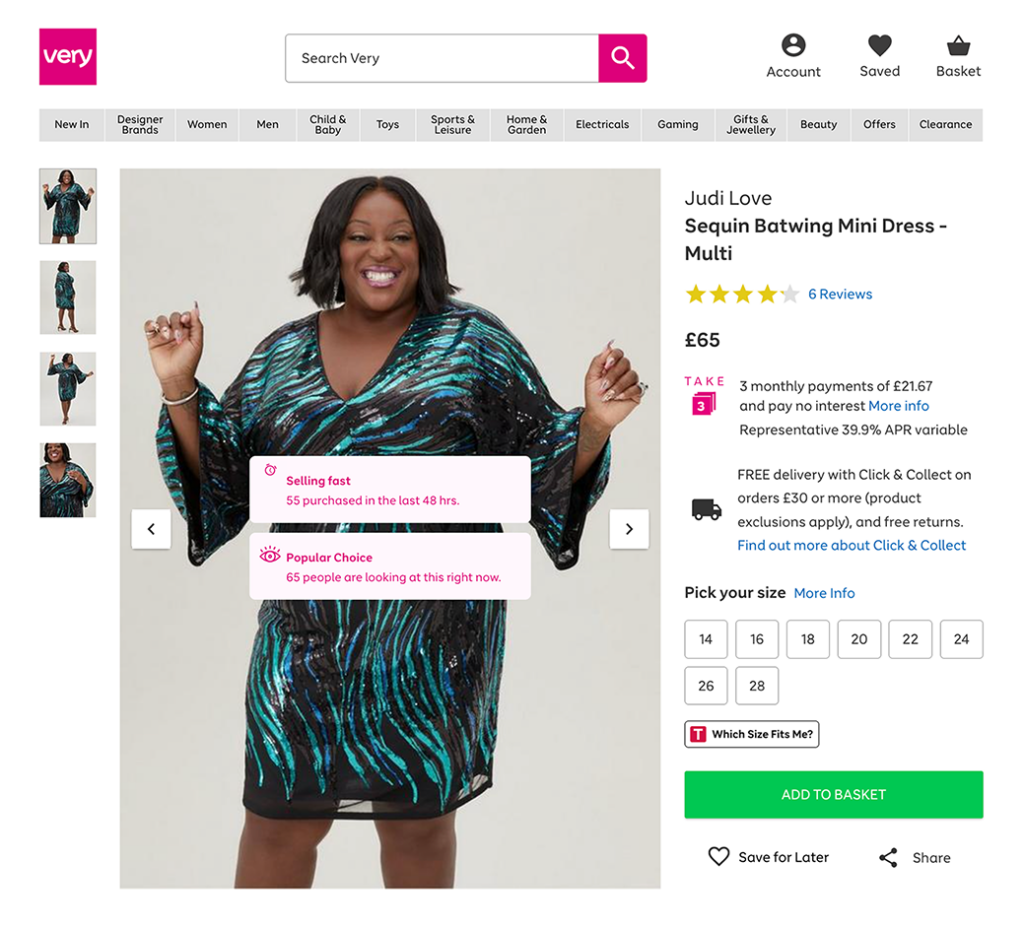
This example from Very.com uses reviews, social proof messages and celebrity endorsement to help build trust with their shoppers.
4. Improve User Experience (UX) with simple, intuitive navigation:
Shoppers should be able to quickly and easily identify the section of your site they’re looking for from your navigation. Some key rules of thumb are:
- Make labels easy to scan by front-loading the key terms
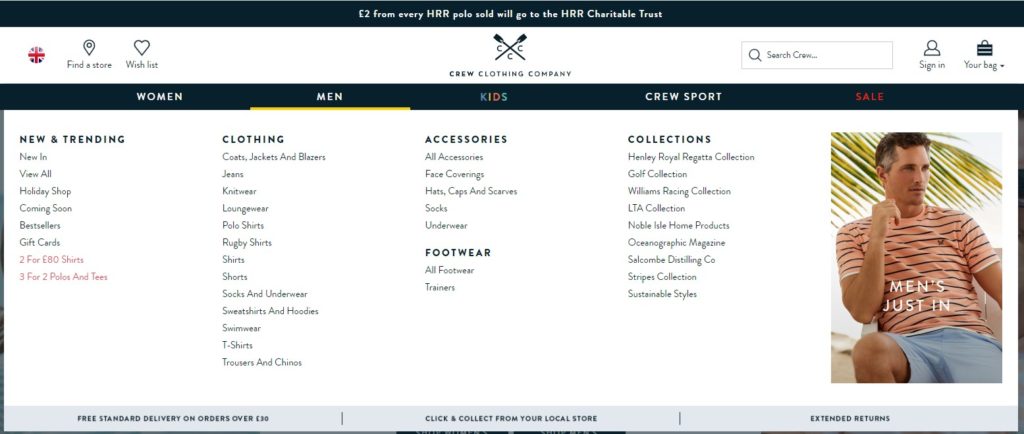
- For sites with many categories and sub-categories, consider Mega Menus, such as the example below from Crew clothing. These can help shoppers drill down through several layers of the site or skip layers if they need to
- Add visuals to support key themes on the site such as the sale call to action in the example below
- Avoid jargon in the link labels. Use terms that are easily identifiable for the shoppers – this will also benefit your SEO efforts
5. Leverage social commerce:
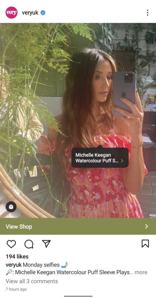
Promoting and selling products using social commerce has created a new revenue stream for businesses. Some eCommerce providers have also seen higher conversion rates than on their website or app.
The image below is an example of Very.com‘s Social Commerce strategy – showing one example, in this case, celebrity endorsement.
6. Offer targeted discounts:
Offering customers discounts based on their previous browsing behaviour can increase their likelihood of converting. This can be through overlays on the website or re-engagement emails for shoppers who have abandoned their basket.
Exit overlays can be a very effective method to keep customers on the site and encourage them to purchase. By triggering an exit overlay message to appear as a user is about to leave the site or after they’ve been on the site for a defined period of time, you can provide an offer that encourages them to complete their purchase.
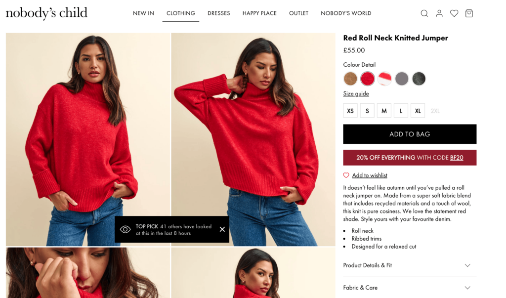
Nobody’s Child take this a step further and encourage it on the Product Details Pages encouraging users to gain a further 20% off by signing up to the newsletter
7. Simplify the purchase process with guest checkout:
A common mistake made by eCommerce brands is to force users to create an account in order to purchase their items. Not only can this lead to basket abandonment, but that shopper may choose never to return. In the example below, you can see the option to continue as a guest.
Offering guest checkout options simplifies the purchasing experience, reducing cart abandonment rates, and directly improving the overall UX on your site.
8. Offer multiple Payment options:
Ecommerce brands must understand the audience they’re selling to and what payment options they would expect. For example:
- “buy now, pay later” options with companies such as Klarna
- Accepting different payment types such as Paypal, Apple Pay in addition to standard credit and debit cards
- Allowing easy coupon or gift card redemption at checkout
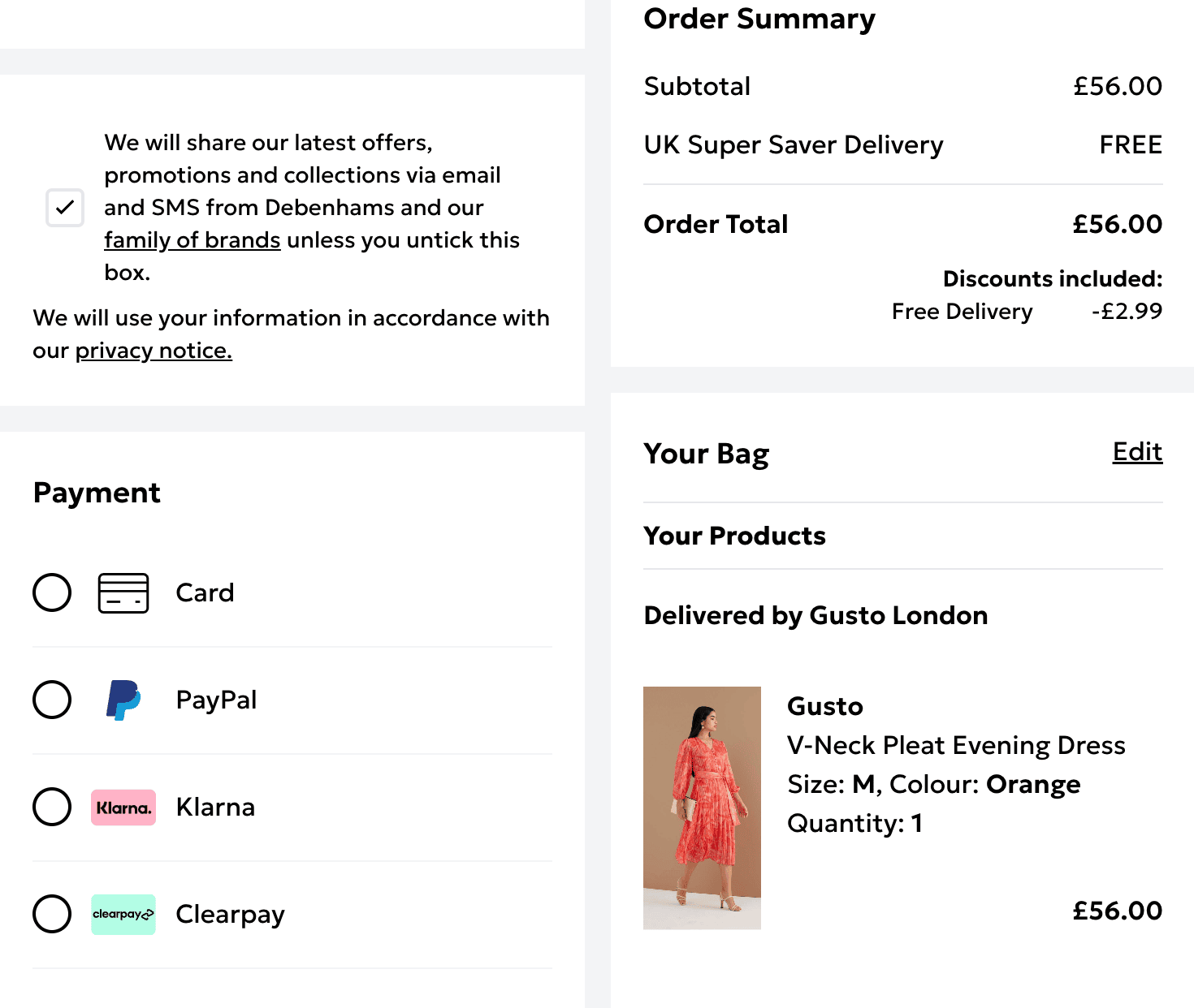
This example from Debenhams allows the use of Promo Codes and Pay Later options with 3 interest free payments.
9. Enhance customer experience with multiple delivery options:
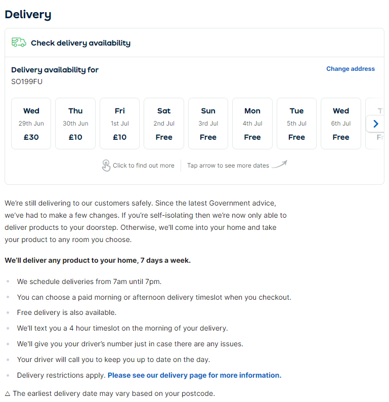
Give shoppers the chance to select the best delivery option, or collection point, for them. The example below from ao.com is a great example of not only different delivery options but also details of how the delivery service works so shoppers know what to expect:
10. Strategic re-targeting campaigns:
If a shopper leaves the site without having completed their purchase, you can use both ads and emails to re-engage them depending on how far through the buying journey they are:
- Remarketing Ads: If a user has already left the site, remarketing them using a range of formats such as display ads, social media formats, video etc, can bring them back into the buying journey
- Abandoned Basket Emails: Depending on a Brand’s Privacy Policy and the country(ies) they operate in, if a user has entered their email address during the checkout process before leaving, then there may be an opportunity to send them an abandonment email. This may include an offer and / or related items
11. Form testing to reduce checkout friction:
Using tools such as Visual Website Optimizer you can discover where users drop off in your checkout process. With this data, you can redesign your forms and perform A/B tests with the existing and new design to see which performs best
12. Capture interest with availability notifications:
If a product isn’t currently available but will be restocked, make sure you capture this interest and let shoppers know when the item is back in stock. A simple ‘notify me’ call to action where the ‘buy now’ button would have been is a simple way to capture interest and email shoppers as soon as the item(s) return
13. Optimise your site speed:
A slow site not only impacts your organic rankings but more importantly, frustrates your shoppers. According to portent.com, a site that loads in 1 second has an e-commerce conversion rate 2.5x higher than a site that loads in 5 seconds. Common factors impacting site speed are:
- Image size: Images should remain under 100KB in size. Consider using plugins such as Imagify or Smush to resize your images
- Limited use of lazy-loading features: Consider lazy-loading images and content that are below the fold
- CSS and JavaScript frequently block the first paint of the page. The key here is to see whether you can delay loading some of the CSS and JavaScript until the first paint of the page is complete
- Third Party Code: Plugins can be great but can also slow up the site. Remove it from the site if you’re no longer using a certain plugin. Adding tags to Tag Management solutions can also slow up the site. As with plugins, you want to audit those tags you have in place and see if any can be removed
14. Make it easy for shoppers to get in contact:
Enhance trust with easy-to-access customer support:
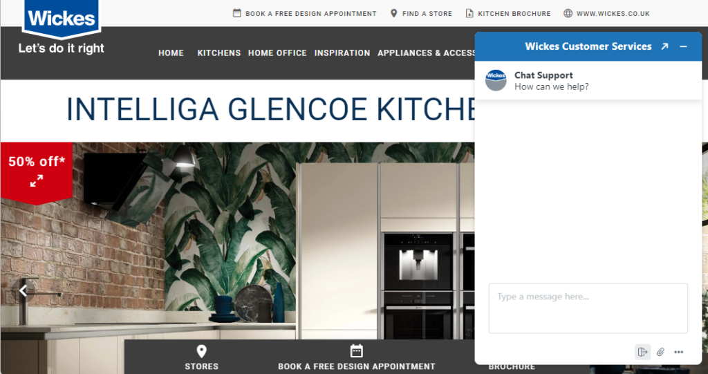
If a shopper were in a physical store, they’d expect to be able to approach a sales assistant, and the online experience should be no different. Provide shoppers with the option to engage with a virtual assistant or chatbots for out-of-hours support. This example from Wickes is present across the site, allowing customers to reach out as and when they need
15. Improve delivery transparency to reduce last‑minute abandonment
Unclear delivery timeframes or hidden delivery fees are major causes of checkout abandonment. Display estimated delivery dates, shipping costs, and any service limitations clearly on PDPs and in the basket.
If next-day or same-day options are available, highlight them early — urgency and convenience can meaningfully improve conversions.
16. Test and iterate continuously to improve performance
No conversion strategy is ever final. Use tools like Google Analytics and Microsoft Clarity to identify where shoppers drop off, which pages convert best, and what influences behaviour. A/B testing is vital for validating changes to page layout, messaging, or calls to action.
Customer feedback tools, like exit surveys or on-site polls, can uncover friction points or missing content. Continuous improvement is the cornerstone of conversion optimisation. Brands that treat CRO as an iterative process see sustained improvements, rather than short-term spikes.
Common Mistakes in Ecommerce Conversion Rate Optimisation (and How to Avoid Them)
Despite good intentions, ecommerce businesses often make common mistakes that undermine conversion rate optimisation efforts:
- Ignoring Mobile Optimisation: Many shoppers browse and purchase via mobile devices. Neglecting a responsive design can severely reduce conversions. Always test your mobile experience thoroughly.
- Complex Checkout Processes: Lengthy, complicated checkouts discourage customers. Simplify checkout by offering guest checkout options, streamlined payment methods, and minimal required fields.
- Overlooking Call-to-Action Clarity: Your CTAs must clearly tell users what to expect next. Ensure your CTAs are visible, actionable, and consistent throughout your site.
A slow site not only impacts your organic rankings but more importantly, frustrates your shoppers. According to portent.com, a site that loads in 1 second has an e-commerce conversion rate 2.5x higher than a site that loads in 5 seconds. Common factors impacting site speed are:
- Image size: Images should remain under 100KB in size. Consider using plugins such as Imagify or Smush to resize your images
- Limited use of lazy-loading features: Consider lazy-loading images and content that are below the fold
- CSS and JavaScript frequently block the first paint of the page. The key here is to see whether you can delay loading some of the CSS and JavaScript until the first paint of the page is complete
- Third Party Code: Plugins can be great but can also slow up the site. Remove it from the site if you’re no longer using a certain plugin. Adding tags to Tag Management solutions can also slow up the site. As with plugins, you want to audit those tags you have in place and see if any can be removed
- Poor-Quality Visuals and Content: Low-quality images or insufficient product information leads to customer hesitation. Always provide high-resolution images, detailed product descriptions, and reviews to build trust and boost conversions
Avoiding these pitfalls can significantly improve your ecommerce conversion rates and ensure a positive shopping experience for customers.
Conversion Rate Optimisation Tools for eCommerce
The key to setting out a Conversion Optimisation Roadmap is to first understand where users are leaving the site and why.
The below tools are just some of those that can be used to help you gain both quantitative and qualitative insights:
This is a user behaviour analytics tool that helps website owners understand how users are interacting with your website through heatmaps and session replays
Cost: Free
Google Analytics
Google Analytics is a widely used tool that allows brands to measure website traffic, conversions and interactions. This can be used to analyse drop offs in the customer journey and the value of each visit
Cost: Free
VWO offer a long list of A/B and multivariate testing tools. They also offer Form Analytics so that you can dig further into where shoppers drop off during the checkout process
Cost: Paid for solution with a tiered pricing model
Taggstar offers a bespoke reporting dashboard that provides real-time reports on the performance of the social proof messages integrated within a brand’s website, app, etc. This provides statistically significant results that quickly identify which messages are actively increasing conversion rates and delivering a higher ROI
Find out how Taggstar can help your business by Booking a Demo with our team today.
Frequently Asked Questions
How can I increase my eCommerce conversion rate?
You can increase your eCommerce conversion rate by enhancing site speed, simplifying the checkout process, offering free shipping, providing high-quality visuals and product details, showcasing social proof, and building trust through security badges and clear policies. Continuous testing and analysis also play a key role.
What is a good eCommerce conversion rate in the UK?
According to Shopify and Littledata, most UK eCommerce stores convert at around 1%–3%, with well-optimised sites regularly achieving 3% or higher depending on the category. Because conversion rates vary so widely by industry, product type and traffic intent, the most meaningful benchmark is how you perform relative to your vertical.
High-intent sectors such as grocery consistently convert above the UK average, while categories with longer buying cycles — like furniture, homeware or electronics — typically sit toward the lower end of the range. If your conversion rate falls noticeably below the typical 1–3% span for your category, it’s a strong indication that improving your UX, product information, trust signals or checkout experience could deliver measurable uplift.
What tools can help with conversion rate optimisation?
Tools like Google Analytics and Microsoft Clarity provide insights into user behaviour, drop-off points, and A/B test results. These tools help identify what’s working and what needs improvement.
Why do people abandon their cart before buying?
Common reasons include unexpected shipping costs, a complicated checkout process, forced account creation, lack of trust signals, and uncertainty around return policies. Addressing these friction points can recover otherwise lost sales.
Why do shoppers hesitate before purchasing online?
Beyond product quality concerns, shoppers hesitate when key information is missing — such as shipping costs, delivery timelines, returns policy details, or customer reviews. Confusion around these can delay or prevent a purchase.
How can I reduce friction on product pages?
Ensure product pages include high-quality visuals, detailed descriptions, clear delivery information, social proof, and easy navigation to related items. Simplifying the layout and prioritising essential content helps reduce cognitive overload.
What role does social proof play in improving conversions?
Social proof helps build trust and reduce hesitation. Reviews, ratings, user-generated content, and real-time social proof messages (like Taggstar’s) reassure customers that others are buying and enjoying the product. This sense of credibility and urgency often leads to higher engagement and more completed purchases.
