
Table of contents
What is a Product Details Page (PDP)?
A Product Detail Page, also referred to as a PDP, is the webpage that provides in-depth details about a specific product on an eCommerce site. The PDP content should include everything a shopper needs to know about a particular product to make an informed purchase decision, including product specifications, color, sizes, materials, pricing, shipping options, and more.
What does a PDP typically include?
-
Breadcrumb: This shows the shopper the path they’ve taken to arrive at the product page or what category/sub-categories the product appears against. E.g. Home > Womens > Dresses > Maxi Dresses.
-
Product Title: This should be the H1 of a page and should help the shopper know immediately what they’re viewing.
-
Description: Often eCommerce sites have both a short and long product description. Typically the short description sits alongside the image/video gallery whilst the long description sits further down the page. The description should accurately describe the product, its features, its benefits whilst also providing useful links to further content. Along with the Product Title, this is a vital part of SEO (search engine optimization) so ensuring relevant keywords and internal links are included will be key to ranking success.
-
Product Images and Videos: Product images and videos should be incorporated into the gallery, providing the user with different angles of the products and close-ups of specific details. Some retailers and brands also use the gallery as an opportunity to incorporate a customer review. Make sure to add alt text to your images as this will also help with SEO.
- Attributes: Adding Global Attributes such as size, color etc to your products helps the shopper choose the right variations for them in addition to supporting product filtering on the Product Listings Pages. The attribute data is also used by Search Engines to provide additional information to searchers. Attribute data can also be used to include Attribute Messaging that highlights important product information upfront, helping shoppers decide if a product meets their needs.
-
Price, Promotion and Availability: Price is of course a key component on the PDP and any offers tend to sit directly alongside this, encouraging shoppers to purchase. Availability is often included in-line to avoid shopper frustration further into the Buying Journey
-
Call-to-Action (CTA): Typically CTAs will include ‘buy now’, ‘save for later’, ‘add to wishlist’ but as we’ll see in the examples below, can also include ‘buy sample’, ‘order a brochure’, ‘visit the store’ and ‘click and collect’.
-
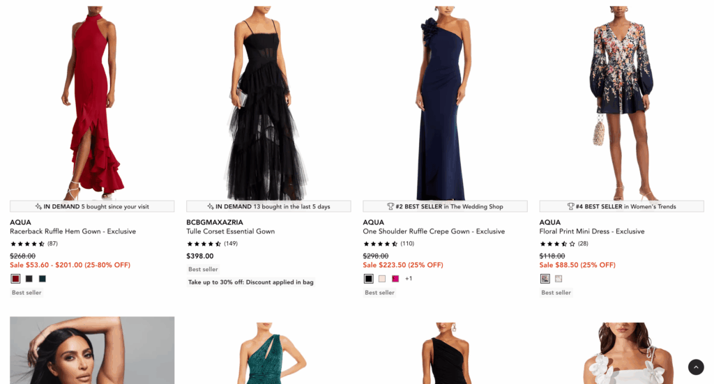
Social Proof: Introducing social proof into the PDP has been statistically and scientifically proven to deliver higher Conversion Rates and a higher Average Order Value (AOV). Social Proof can come in many forms including scarcity messages, urgency messages and trending messages to name a few.
-
Cross-Selling and Up-Selling: This can come in many forms including: bundles, ‘also bought with’, ‘customers also bought and ‘frequently bought together’. These strategies can not only help to reduce shoppers leaving your site but can also substantially increase your Average Order Value metric.
-
Policies: Returns policies and privacy policies are commonly included on the PDP.
-
Shipping information: 48% shoppers cite extra costs as being a key reason for online cart abandonment rates according to research by the Baymard Institute.
Why is a Product Details Page so important for Conversion Optimization?
The Product Detail Page is a vital part of any eCommerce strategy as it is the page that leads directly to a sale. With the majority of traffic from search engines, marketing campaigns and social media today driving visitors directly to the PDP, the page is increasingly becoming the first point of contact a shopper and potential customer has with your site. The PDP therefore serves multiple purposes – it must capture the shoppers attention, engage and convince her/him to spend more time on the page, make a purchase decision and explore other pages on the site.
If the content and design of your PDP is incomplete, incorrect or not intuitive, your shoppers will likely leave without making a purchase.
Knowing what information a shopper wants and presenting it in an intuitive manner is the key to the success of a PDP. The Product Detail Page design should undergo continual A/B testing as part of a wider Conversion Rate Optimization strategy.
Balancing the amount of product information that’s included with how it is structured and including best practice functionality is the key to delivering an optimal shopper experience.
Best Practices for PDP Design in 2025
With an understanding of why the PDP in retail is so important and an overview of key components of the PDP, the next step is leveraging best practices for PDP design and functionality to optimize user experience and increase conversion rates.
- Mobile optimization – With nearly 70% of online shopping done on a mobile device it is critical to ensure that your shopping experience is mobile optimized. That means ensuring that key product information on your PDP is easy to find, that the load speed is fast and the mobile UI is responsive.
- Reviews and ratings – Shoppers rely on reviews and ratings on the PDP to help inform their purchase decisions, but with sometimes hundreds or thousands of reviews it can be overwhelming and time consuming for shoppers to find the relevant information they need. Consider aggregating reviews, summarizing insight, integrating social proof and enabling review filters to optimize the PDP.
- Social Proof: By showcasing what other customers are looking at and buying, you will improve shopper confidence and by tapping into people’s fear of missing out (FOMO), you can encourage a shopper to buy before an item is sold out. Introducing social proof into the PDP is statistically and scientifically proven to deliver higher Conversion Rates and a higher Average Order Value (AOV). By aggregating shopping and browsing behavior in real-time, Social Proof can come in many forms, including bestseller, trending and popularity messaging.
- Attribute messaging: Too often, key product attributes that shoppers are looking for, are buried below the fold on the PDP. Attribute messaging captures a shopper’s attention by highlighting essential product information upfront.
- User-generated content: UGC (User-Generated Content) on the product detail page that showcases real people using the product helps build authenticity and increases trust in a brand. UGC can take different forms such as images pulled from social media, reviews with photos and videos and user-generated FAQs.
Product Details Page Design Examples
Below are three product detail page examples that include PDP best practices and design recommendations.
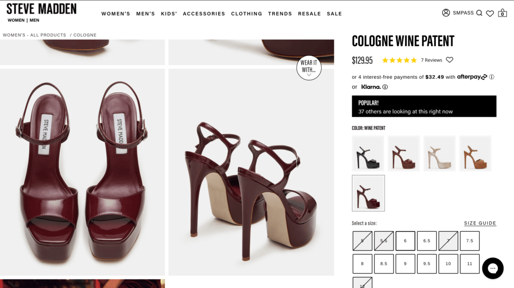
Steve Madden key highlights:
- Reviews are aligned with the price: This immediately provides shoppers with aggregated shopper feedback at a glance that are easy to find.
- Flexible payment options are highlighted upfront: The site includes flexible payment options directly below the price, providing shoppers with multiple ways to pay for an item.
- High quality visuals: PDP imagery mixes high quality product images with editorial style images to showcase the product in use.
- Social Proof Messages: Social proof messages that help shoppers make informed purchasing decisions based on the real-time behaviors of others are displayed boldly at the top of the page.
- Wear it With: Stevemadden.com includes an outfitting section with complementary outfit ideas to help shoppers envision how to wear but also to promote cross sell opportunities.
- Detailed product reviews with filters and Q&A: Shoppers are able to refine reviews based on a number of filters including sizing and age.
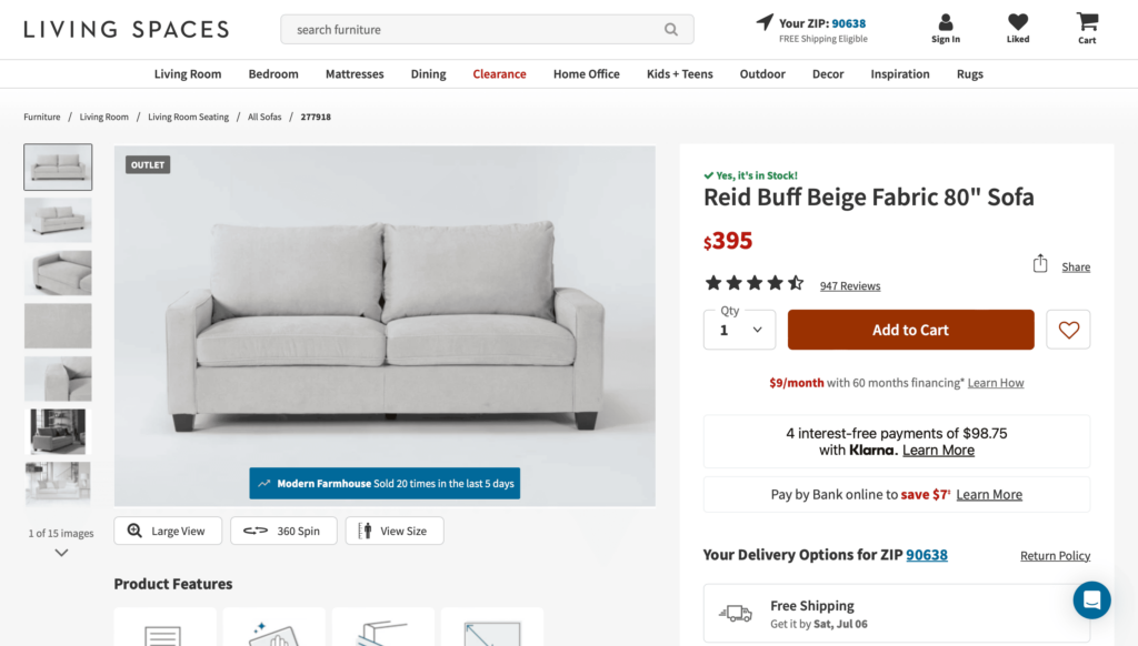
Living Spaces key highlights:
- Availability integrated in line with product price: By sharing this information in a prominent position, it saves disappointment and frustration further into the Buying Journey.
- Multiple ways to view product: Beyond traditional product photos, shoppers can view the product in a relevant setting and select other products to view with the product to provide context. This helps the shopper better visualize and how it might look in a specific setting.
- Delivery options and estimates: Offers multiple delivery options with costs and estimated delivery dates to help set expectations and improves the overall customer experience.
- Finance Options: Living Spaces provides alternative payment options including financing, increasing their potential customer base.
- Social Proof: In addition to reviews, Livingspaces.com also integrates social proof messaging into their image gallery, highlighting real-time data.
- Easy-to-find and detailed product specs: The site includes visual categorization of specifications and detailed tables along with care and assembly instructions.
- Upsell and cross sell: Livingspaces.com product detail pages include many different areas promoting recommended and complementary products and related products, helping shoppers find the right product for them and also encouraging customers to buy more.
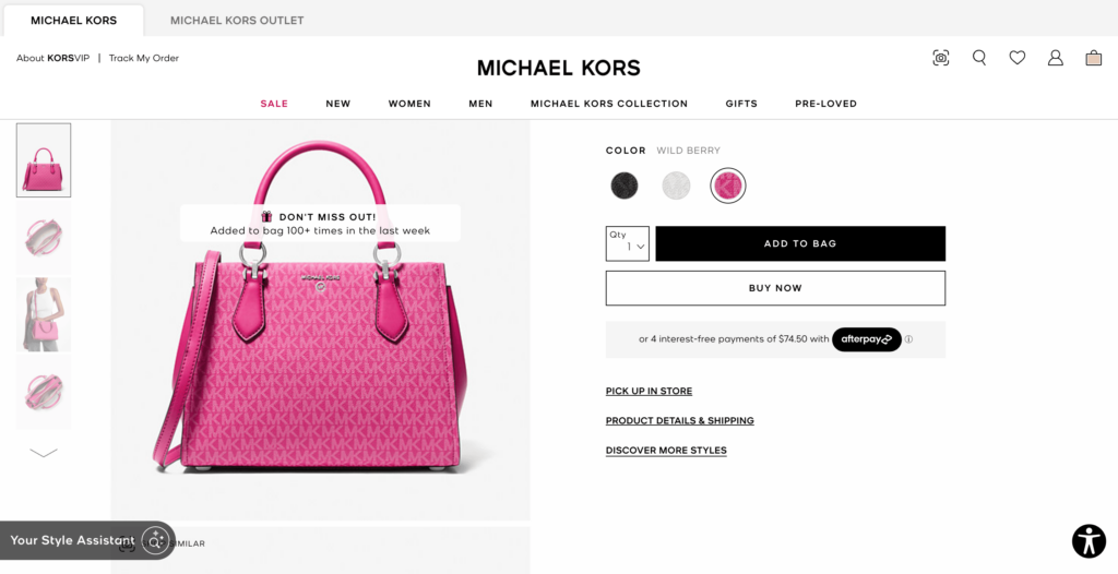
Michael Kors key highlights:
- Search similar: Leveraging visual search, the PDP displays an option to browse visually similar products at the top of the page. The search icon activates a pop up window with similar product results and advanced filtering.
- Social proof: Prominently displayed at the top of the PDP, as an overlay on the product image, social proof messages on michaelkors.com include animated icons and real-time data that captures shopper attention as soon as she/he lands on the page.
- Shop the look: The PDP includes a “shop the look” section on relevant pages that highlight related or complementary products.
- Product recommendations: In addition to the “shop the look” feature, the page invites
How to Optimize PDP Pages with Social Proof
An enormous amount of site traffic flows from search engines, social media and other marketing sources directly to the PDP, and a large part of eCommerce success therefore hinges on the effectiveness of this page. The PDP needs to be relevant to the shoppers intention, capture their attention and either convert into a sale or encourage them to stay on the site and engage with other pages.
Retailers and brands can leverage different forms of social proof on the PDP such as reviews and ratings, user-generated content and social proof messaging.
By including social proof messaging on the eCommerce PDP, retailers and brands are able to significantly boost shopper engagement and increase conversions. Social proof aggregates what other customers are looking at and buying in real-time and transforms this data into engaging messages that capture shopper attention and improves shopper confidence. By aggregating shopping and browsing behavior in real-time, social proof messaging can come in many forms, including bestseller, trending, popularity and urgency messaging. Social proof messaging can also be combined with ratings and reviews to display the most powerful combination of social proof above the fold.
The Taggstar Social Proof Solution is extremely easy to integrate on the PDP, PLP and across the customer journey, and is available for enterprise retailers as well as brands that are growing their eCommerce business.