What is Above the Fold?
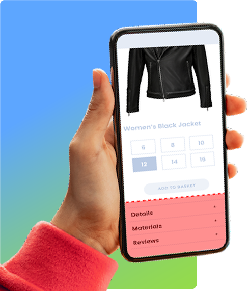
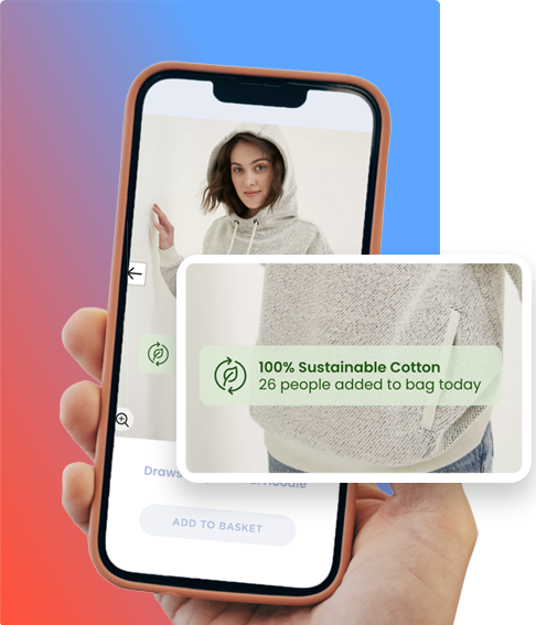
The term “Above the Fold” originates from the newspaper industry, where the most captivating headlines and visuals were strategically placed on the upper half of the front page, visible without unfolding the paper. Translated to the eCommerce world, “Fold” signifies where the browser window ends on the user’s screen, meaning “Above the Fold” refers to the content instantly visible without any scrolling.
Best Practices for Above the Fold
Crafting an impactful above the fold experience requires deliberate planning and strategic design:
- Compelling Hero and Product Visuals. By utilizing high-quality visuals that resonate with the target audience, the page can immediately pique their interest and create an emotional connection. The hero image should not only be visually striking but also communicate the product identity.
- Clear Value Proposition. This should be done in a succinct and persuasive manner, highlighting the unique selling proposition, benefits of the products or services and highlighting relevant product attributes. By clearly articulating these aspects, the page can immediately communicate the value offered to visitors and encourage them to explore further.
- Fast Load Speeds. One of the most crucial aspects of above the fold best practices is to ensure fast load speeds. Users tend to have limited patience and may leave a website if it takes too long to load. To optimize load speeds, minimize the size of images and other media files, reduce the number of HTTP requests, and remove any unnecessary scripts or elements that could slow down the website.
- Ads and Original Content. While ads can generate revenue, it’s essential to strike a balance between ads and original content to provide a positive user experience. Overloading the above the fold section with ads can make the website appear cluttered and untrustworthy. Instead, focus on providing valuable and engaging content that users will find useful. Consider placing ads strategically, ensuring they do not overshadow or interfere with the user’s ability to access the content easily.
- CTA buttons. Call to Action or CTA buttons are important factors in conversions. Depending on the website you are building, CTA buttons can be placed above the fold area as long as they fit in organically, such as ‘save to wish list’, ‘add to cart’, or ‘buy now’.


